Introduction
Credits
UX and Brand Designer
Génesis Peña
UX and Brand Designer
Efraín Martinez
The context
Trip planning is fragmented across multiple platforms, forcing users to manage information manually and increasing mental effort. This project explores how a single product could simplify planning while supporting different user behaviors and needs
My Role: Led the project end-to-end, from research to high-fidelity prototype, focusing on how product structure could reduce complexity and support different planning behaviors.
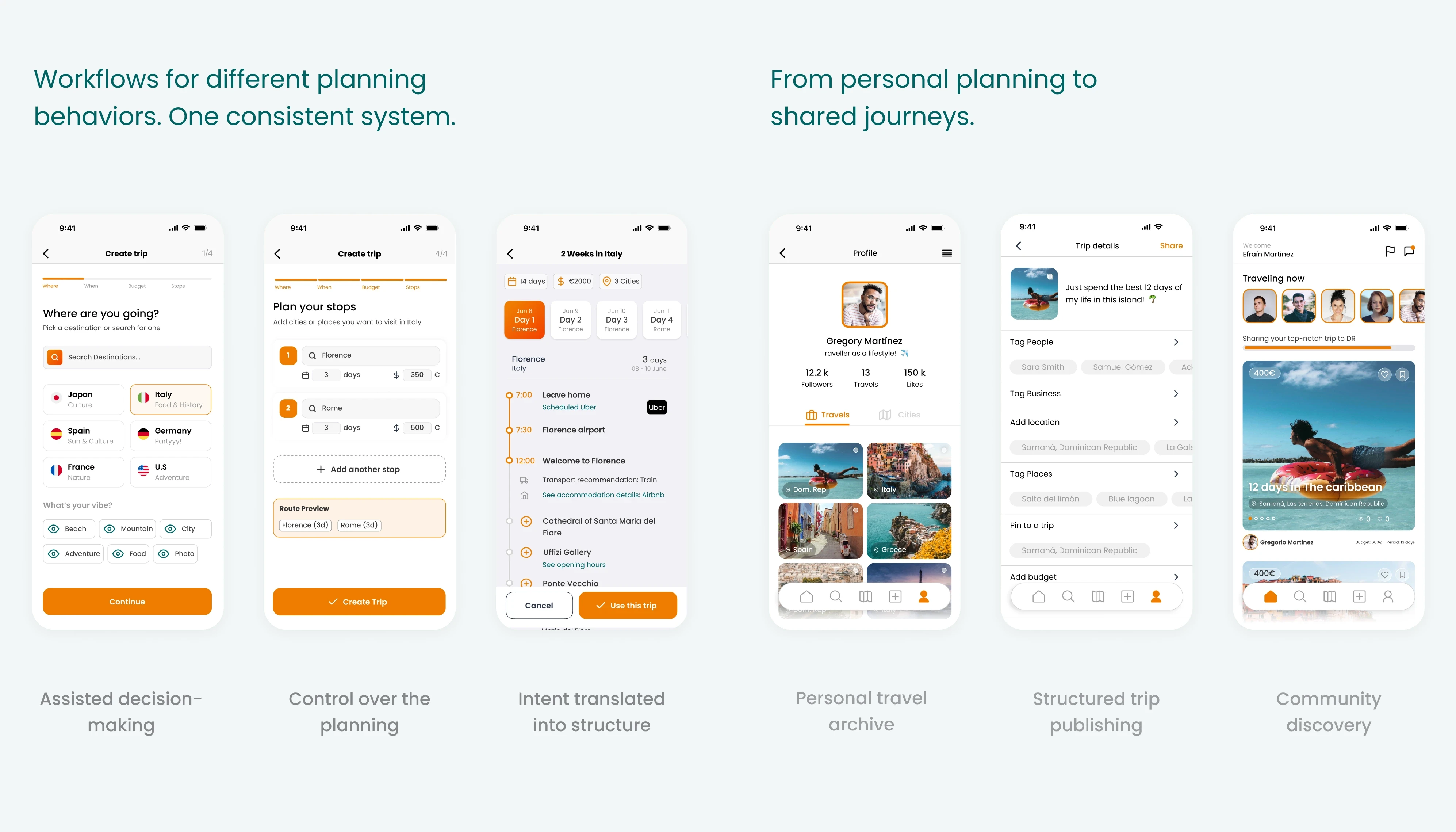
Process: Started with behavioral research to understand fragmented trip planning workflows, defined two primary user types (creators and consumers), mapped user journeys, and designed parallel workflows to reduce friction while preserving control.
Challenge
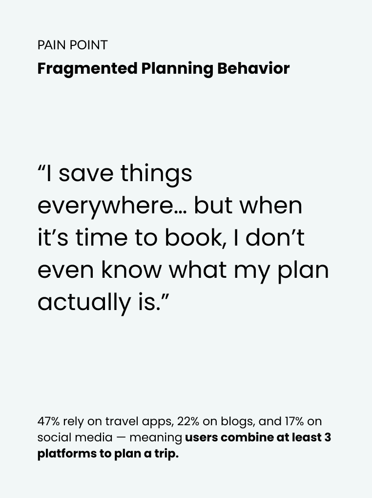
Research with 100 participants showed that trip planning is highly fragmented. Most people use at least three different platforms to research and plan a trip—mainly blogs, social media, and travel apps—while relying on notes or spreadsheets to document everything.
This fragmentation creates uncertainty around budget, itinerary choices, and whether they are making the right decisions. According to the survey, three clear needs emerged:
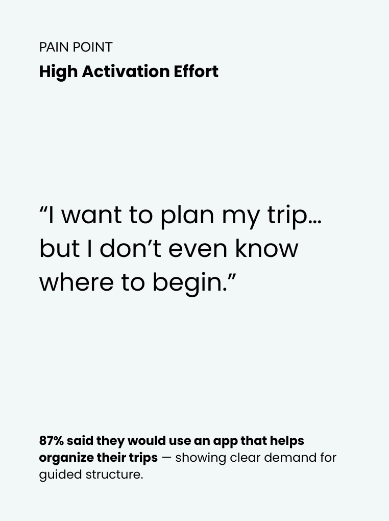
87% want a tool to organize trips
72% value recommendations from similar travelers
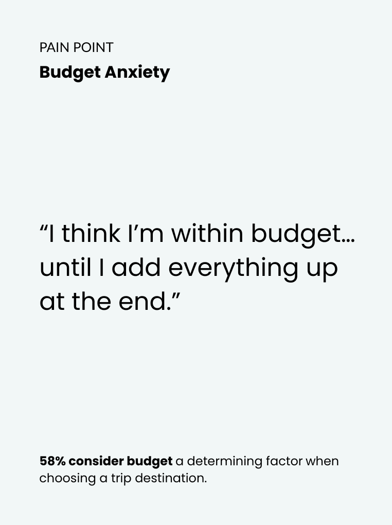
58% prioritize budget
Jumping between maps, booking platforms, notes, and spreadsheets increases mental effort and makes trips hard to organize and maintain over time.
The challenge was to help people organize trips in a way that feels easy, valuable, and worth repeating.
Solution
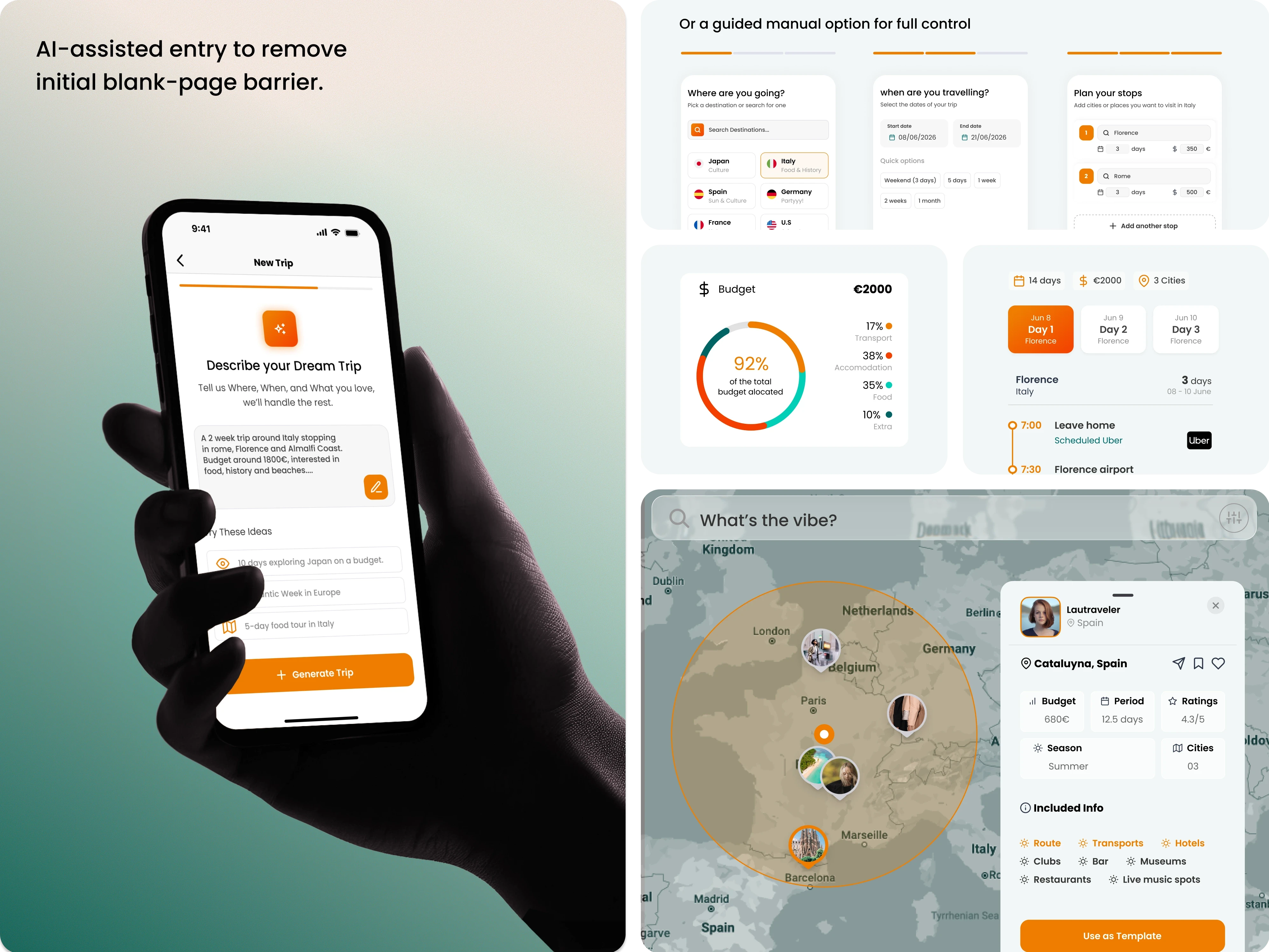
To quickly explore visual directions and layout structures, I used AI-assisted tools (Lovable) to generate initial interface concepts. This allowed me to rapidly test different approaches to hierarchy, color, and component distribution before refining the system manually.
The solution focuses on making trip creation easy enough that people prefer using the platform over spreadsheets or disconnected tools.
Designing for how people actually plan: Instead of forcing a linear flow, the system adapts to different entry points (budget, destination, or dates), reducing friction from the start.
Removing planning friction: Eliminated the blank-page problem by introducing templates and AI-assisted starting points.
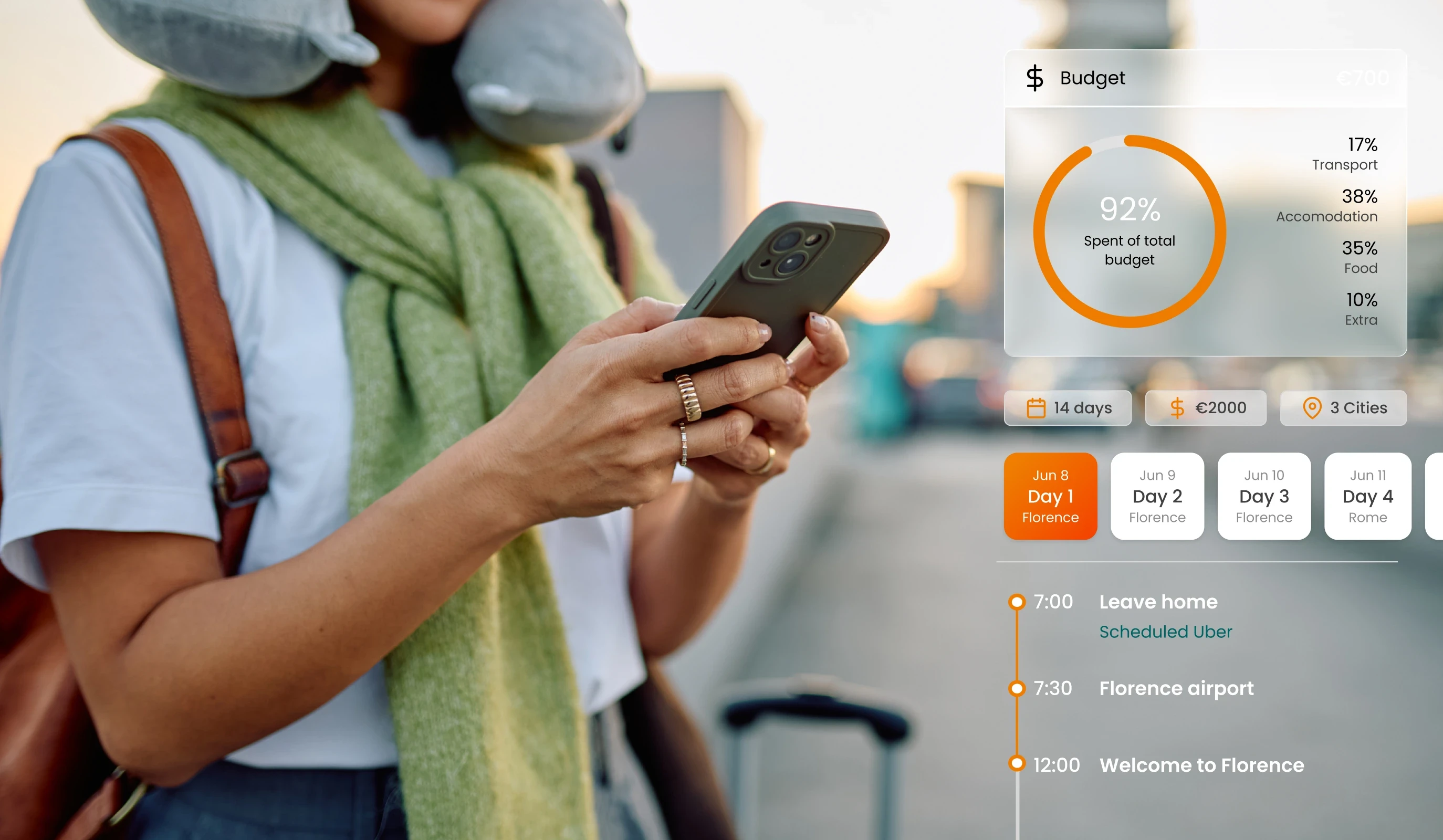
Keeping decisions connected: Integrated itinerary, routes, and budget into a single system so changes update in real time, reducing uncertainty.
Making complexity scannable: Designed a visual structure that allows users to quickly understand their trip without switching between tools.
Turning planning into shared value: Enabled users to reuse and adapt trips, transforming individual planning into a collaborative ecosystem.


The Outcome
By making planning easier and more structured, users are more likely to complete, reuse, and share trips—creating a foundation for a scalable travel ecosystem.
The product evolves into a social platform for travelers:
Content consumers can explore real trips created by others, see images, routes, and budgets, and choose trips that match their travel style and spending limits.
Content creators are motivated to document trips because their planning becomes reusable content, visible to others and rewarded through engagement and loyalty-based incentives.
Key design decisions
“Where do you want to start?” → planning is non-linear
Route + budget updating together → decisions stay connected
Day view + map + cost breakdown → clarity at a glance
AI as an entry point, not the driver → control stays with the user


