Introduction
Credits
Brand designer
Génesis Peña
The context
Brand identity for a company specializing in digital sales training, helping traditional sales professionals transition into tech-focused roles.
My Role: Led the brand strategy and visual identity development.
Process: Clarified the brand’s positioning and problem statement, defined key personas, and analyzed competitors to identify differentiation opportunities. Synthesized insights into visual territories, established color and design principles, and developed multiple identity proposals rooted in research.
Challenge
Yinius is a Digital Academy that helps experienced sales professionals move from traditional to digital selling. The challenge was to create a brand that spoke to people in career transition — easing their fears of change and inspiring them to pursue the freedom and flexibility of remote work with confidence.

Solution
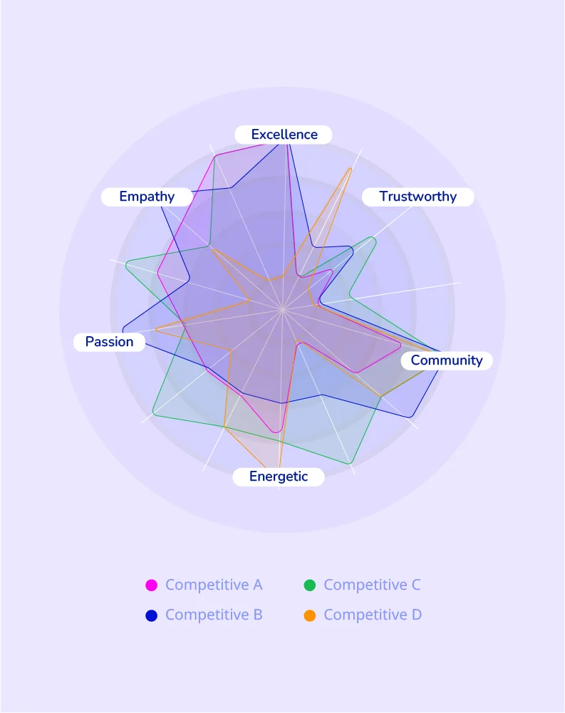
I started by defining the brand personality through competitive analysis of digital education leaders. This research helped shape a position that balances approachability and innovation, reflecting a community-driven yet tech-savvy spirit.
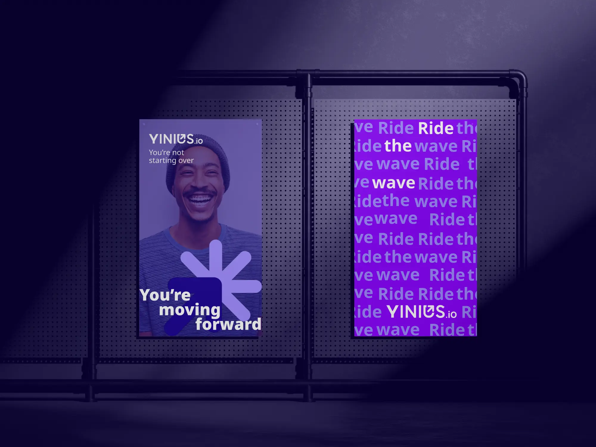
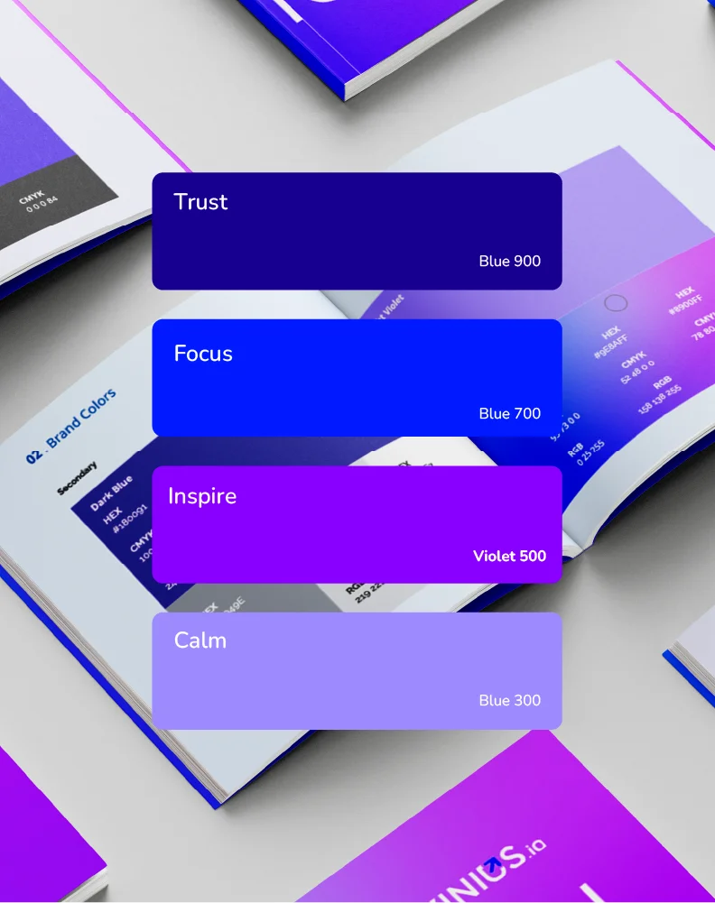
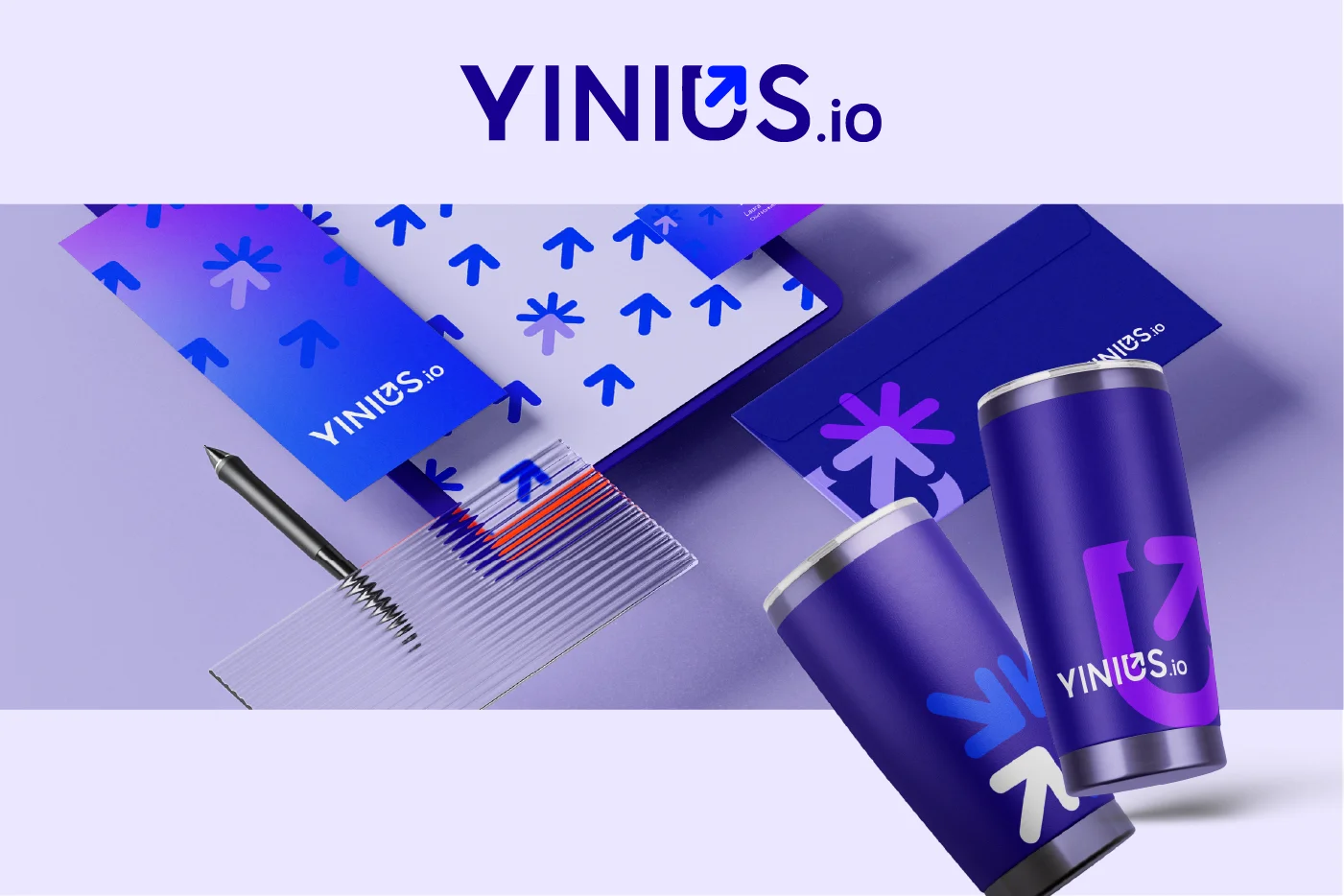
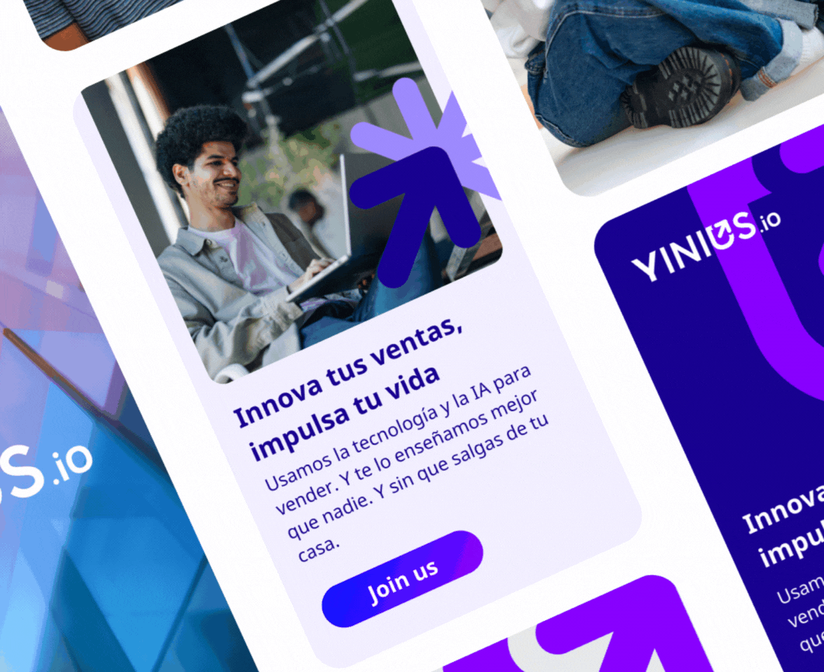
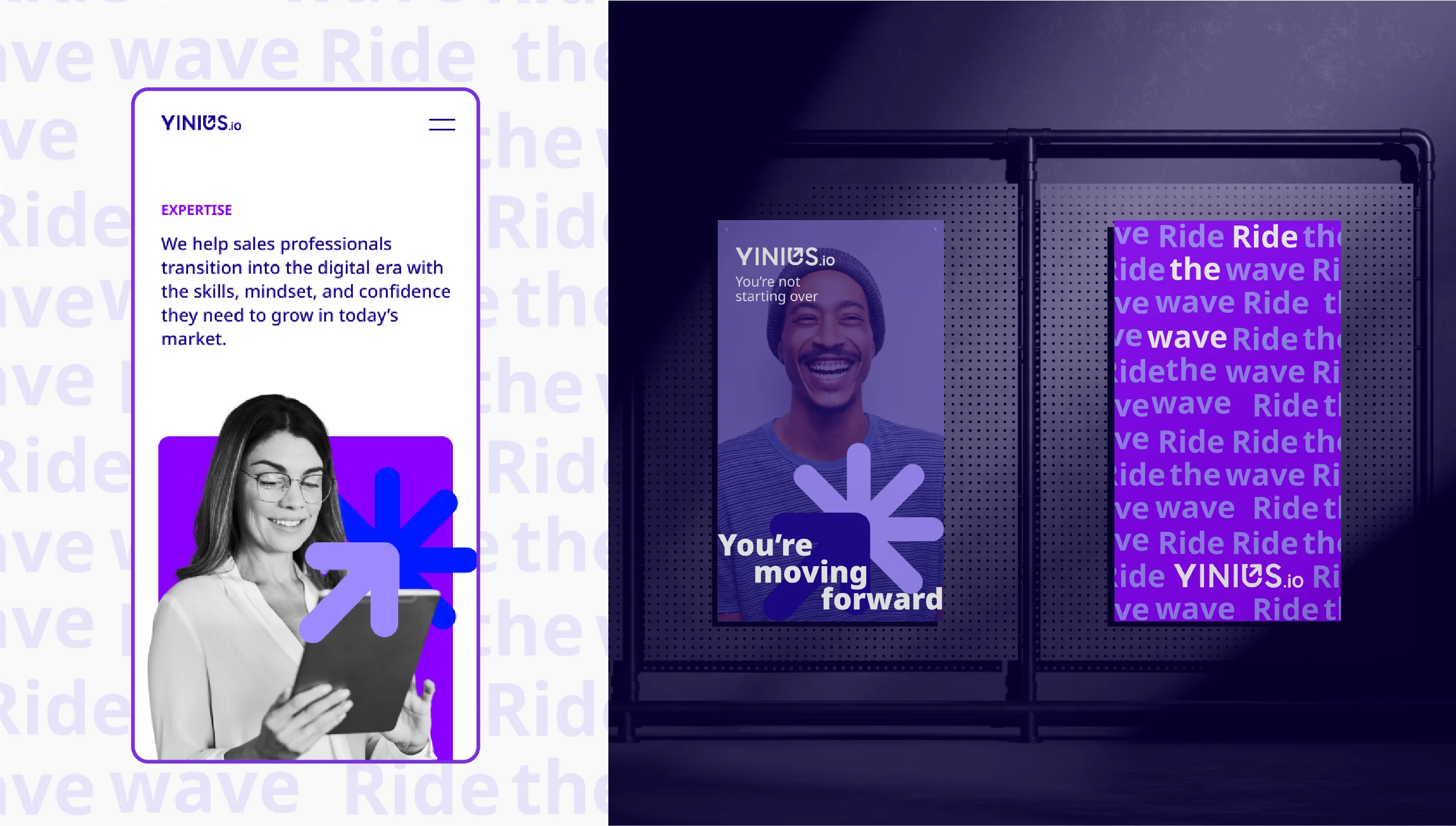
Visually, the brand uses vibrant violet and electric blue to symbolize progress, confidence, and learning — supported by white space and contrast for a clean, professional look. The logo concept combines a forward arrow and a click icon, representing momentum and digital transformation — the journey from traditional to modern selling.

The Outcome
I started by defining the brand personality through competitive analysis of digital education leaders. This research helped shape a position that balances approachability and innovation, reflecting a community-driven yet tech-savvy spirit.
Visually, the brand uses vibrant violet and electric blue to symbolize progress, confidence, and learning — supported by white space and contrast for a clean, professional look. The logo concept combines a forward arrow and a click icon, representing momentum and digital transformation — the journey from traditional to modern selling.
The final identity captures the company’s core values, innovation, community, and opportunity, and translates them into a brand that feels human, energetic, and credible. Within just one week of launch, the new brand was fully adopted across all channels: social media templates were updated, the announcement campaign went live, and the team began sharing content seamlessly.


